4,096
123
0
176
0
67,376

0 reactions
How professional athletes lean politically: A breakdown of 1,500+ voter registration files across 5 leagues.
#education
source
#education
source




0 reactions
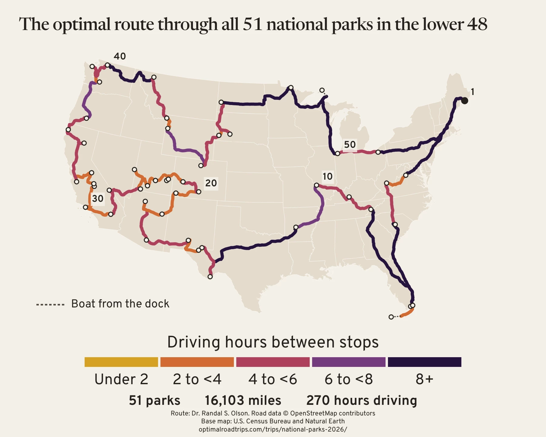
The fastest loop through all 51 national parks in the lower 48 is 16,103 miles and 270 hours of driving
Data: road distances and drive times from OpenStreetMap, routed between each park's main visitor center. The stops are every national park in the lower 48 on the National Park Service list, which is 51 today. For Channel Islands, Dry Tortugas, and Isle Royale, the drive ends where you catch the boat.
Tools: Python for the routing and the solver, and JavaScript and SVG for the map.
Each leg is shaded by its driving time. The western parks sit close together, so most legs out there are short. The 5 longest legs are connectors between regions, and together they take about 65 of the 270 hours:
- Cuyahoga Valley back to Acadia, 14.4 hours
- Acadia to Shenandoah, 13.8 hours
- Biscayne to Great Smoky Mountains, 13.7 hours
- Hot Springs to Big Bend, 12.5 hours
- Congaree to Everglades, 10.4 hours
The visit order is proven fastest for these 51 stops and the modeled drive times. It's a loop, so you can start anywhere and the total stays the same.
Visit order:
1. Acadia National Park, ME
2. Shenandoah National Park, VA
3. New River Gorge National Park and Preserve, WV
4. Congaree National Park, SC
5. Everglades National Park, FL
6. Dry Tortugas National Park, FL
7. Biscayne National Park, FL
8. Great Smoky Mountains National Park, TN
9. Mammoth Cave National Park, KY
10. Gateway Arch National Park, MO
11. Hot Springs National Park, AR
12. Big Bend National Park, TX
13. Carlsbad Caverns National Park, NM
14. Guadalupe Mountains National Park, TX
15. White Sands National Park, NM
16. Saguaro National Park, AZ
17. Grand Canyon National Park, AZ
18. Petrified Forest National Park, AZ
19. Mesa Verde National Park, CO
20. Great Sand Dunes National Park and Preserve, CO
21. Black Canyon of the Gunnison National Park, CO
22. Canyonlands National Park, UT
23. Arches National Park, UT
24. Capitol Reef National Park, UT
25. Bryce Canyon National Park, UT
26. Great Basin National Park, NV
27. Zion National Park, UT
28. Death Valley National Park, CA
29. Joshua Tree National Park, CA
30. Channel Islands National Park, CA
31. Sequoia National Park, CA
32. Kings Canyon National Park, CA
33. Yosemite National Park, CA
34. Pinnacles National Park, CA
35. Lassen Volcanic National Park, CA
36. Redwood National and State Parks, CA
37. Crater Lake National Park, OR
38. Mount Rainier National Park, WA
39. Olympic National Park, WA
40. North Cascades National Park, WA
41. Glacier National Park, MT
42. Yellowstone National Park, WY
43. Grand Teton National Park, WY
44. Rocky Mountain National Park, CO
45. Wind Cave National Park, SD
46. Badlands National Park, SD
47. Theodore Roosevelt National Park, ND
48. Voyageurs National Park, MN
49. Isle Royale National Park, MI
50. Indiana Dunes National Park, IN
51. Cuyahoga Valley National Park, OH
Full route with season and access notes for each park:
https://optimalroadtrips.com/trips/national-parks-2026/
Pick your own set of parks and get their fastest order:
https://optimalroadtrips.com/build/
#education
source
Data: road distances and drive times from OpenStreetMap, routed between each park's main visitor center. The stops are every national park in the lower 48 on the National Park Service list, which is 51 today. For Channel Islands, Dry Tortugas, and Isle Royale, the drive ends where you catch the boat.
Tools: Python for the routing and the solver, and JavaScript and SVG for the map.
Each leg is shaded by its driving time. The western parks sit close together, so most legs out there are short. The 5 longest legs are connectors between regions, and together they take about 65 of the 270 hours:
- Cuyahoga Valley back to Acadia, 14.4 hours
- Acadia to Shenandoah, 13.8 hours
- Biscayne to Great Smoky Mountains, 13.7 hours
- Hot Springs to Big Bend, 12.5 hours
- Congaree to Everglades, 10.4 hours
The visit order is proven fastest for these 51 stops and the modeled drive times. It's a loop, so you can start anywhere and the total stays the same.
Visit order:
1. Acadia National Park, ME
2. Shenandoah National Park, VA
3. New River Gorge National Park and Preserve, WV
4. Congaree National Park, SC
5. Everglades National Park, FL
6. Dry Tortugas National Park, FL
7. Biscayne National Park, FL
8. Great Smoky Mountains National Park, TN
9. Mammoth Cave National Park, KY
10. Gateway Arch National Park, MO
11. Hot Springs National Park, AR
12. Big Bend National Park, TX
13. Carlsbad Caverns National Park, NM
14. Guadalupe Mountains National Park, TX
15. White Sands National Park, NM
16. Saguaro National Park, AZ
17. Grand Canyon National Park, AZ
18. Petrified Forest National Park, AZ
19. Mesa Verde National Park, CO
20. Great Sand Dunes National Park and Preserve, CO
21. Black Canyon of the Gunnison National Park, CO
22. Canyonlands National Park, UT
23. Arches National Park, UT
24. Capitol Reef National Park, UT
25. Bryce Canyon National Park, UT
26. Great Basin National Park, NV
27. Zion National Park, UT
28. Death Valley National Park, CA
29. Joshua Tree National Park, CA
30. Channel Islands National Park, CA
31. Sequoia National Park, CA
32. Kings Canyon National Park, CA
33. Yosemite National Park, CA
34. Pinnacles National Park, CA
35. Lassen Volcanic National Park, CA
36. Redwood National and State Parks, CA
37. Crater Lake National Park, OR
38. Mount Rainier National Park, WA
39. Olympic National Park, WA
40. North Cascades National Park, WA
41. Glacier National Park, MT
42. Yellowstone National Park, WY
43. Grand Teton National Park, WY
44. Rocky Mountain National Park, CO
45. Wind Cave National Park, SD
46. Badlands National Park, SD
47. Theodore Roosevelt National Park, ND
48. Voyageurs National Park, MN
49. Isle Royale National Park, MI
50. Indiana Dunes National Park, IN
51. Cuyahoga Valley National Park, OH
Full route with season and access notes for each park:
https://optimalroadtrips.com/trips/national-parks-2026/
Pick your own set of parks and get their fastest order:
https://optimalroadtrips.com/build/
#education
source