#InteriorDesign #ColorSwatches I love design and topics…

12 reactions
#InteriorDesign #ColorSwatches
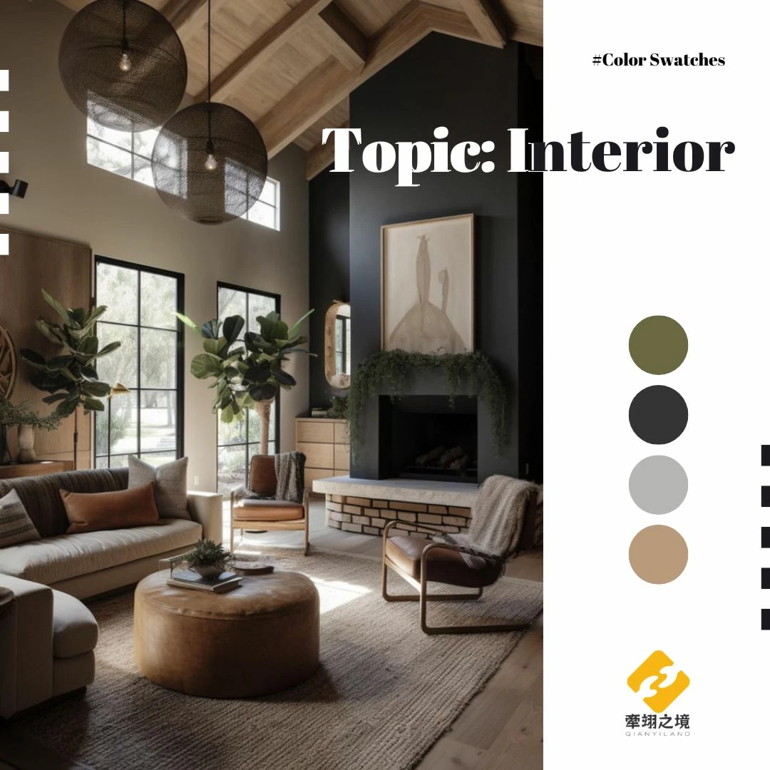
I love design and topics related to it. Have you ever wondered why we often can't coordinate soft furnishings like those in professional magazines? Sometimes they just don't seem to match or appear cluttered. Sometimes the key is the balance of color combinations. Starting now, I'll be sharing various color swatches periodically. Feel free to save them and use them to create your favorite spaces!😘
Image Reference https://pin.it/4MLg86YHW
I love design and topics related to it. Have you ever wondered why we often can't coordinate soft furnishings like those in professional magazines? Sometimes they just don't seem to match or appear cluttered. Sometimes the key is the balance of color combinations. Starting now, I'll be sharing various color swatches periodically. Feel free to save them and use them to create your favorite spaces!😘
Image Reference https://pin.it/4MLg86YHW


4

1
| 74,000 mlx | |
| 30 | |
| 12 |
comments

As an architecture student, I agree. We use colour theory to emphasise a certain space and how each colour and shade combine to make that space lively.

1
1
Ha! Thank you. 👍 At the same time, I think it doesn't necessarily have to be lively. For example, in a bedroom, I would want it to be calm and comfortable, with a sense of tranquility!
1