#DesignTheTangledLogo @alidino g/studio #earn I’ve been…

3 reactions
#DesignTheTangledLogo
#earn
I’ve been thinking a lot about what makes Tangled.com special. It’s not just a social site; it’s an ecosystem where our voices actually have value—literally! I wanted to design a logo that reflects that synergy between creativity and the millix economy.
The Design Concept 💭
My goal was to move away from complexity and toward a symbol that feels fluid, professional, and rewarding.
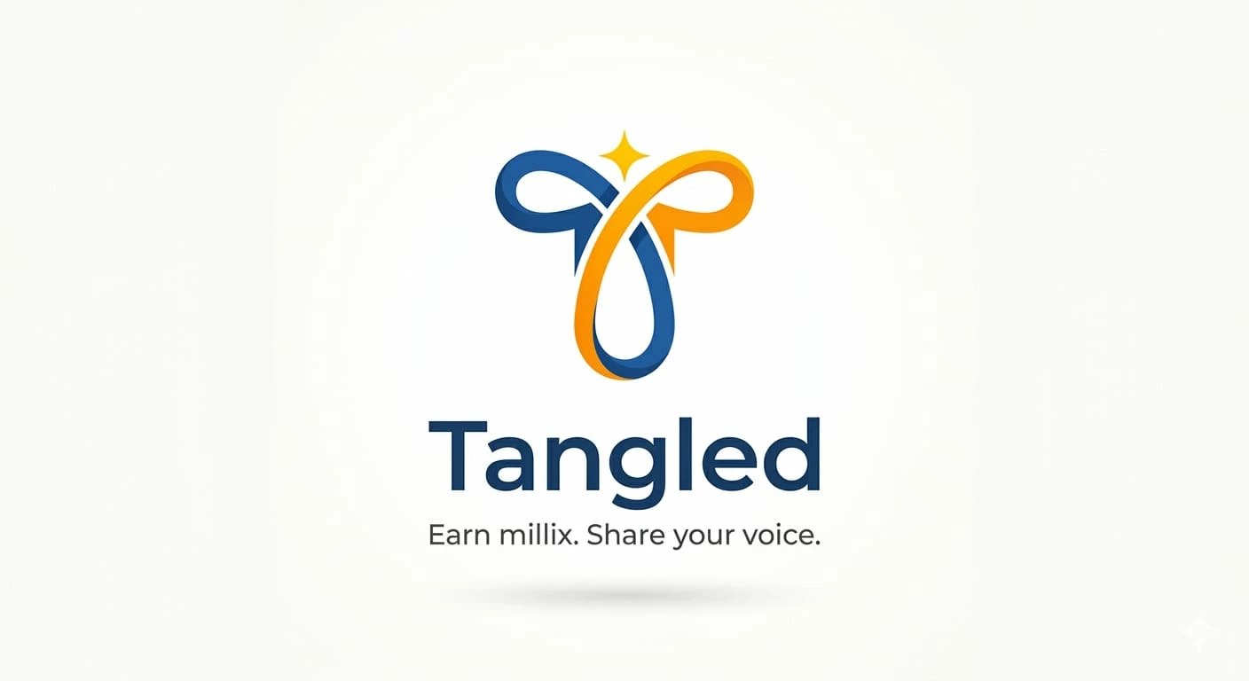
The Symbol (The Interwoven 'T'): The logo features two looping paths that form a stylized "T." This represents our social "tangle"—the way our stories and interactions weave together to form a community.
The Gold & Blue Palette: * Millix Gold (🟡): The vibrant orange-gold represents the millix we earn. It’s the energy and the reward flowing through the platform.
Trust Blue (🔵): The deep blue represents the stability of the network and the depth of the conversations we have here.
The North Star Spark (✨): At the crown of the logo is a single spark. This is the "Creative Spark"—the moment you hit 'post' and share something unique with the world.
Why This Represents Tangled 💛
Tangled is where digital interaction meets tangible value. The continuous loop in the design shows that this is a circular economy: we provide the content, the community provides the engagement, and the platform provides the millix.
Everything is interconnected. Everything is "Tangled."
#earn
I’ve been thinking a lot about what makes Tangled.com special. It’s not just a social site; it’s an ecosystem where our voices actually have value—literally! I wanted to design a logo that reflects that synergy between creativity and the millix economy.
The Design Concept 💭
My goal was to move away from complexity and toward a symbol that feels fluid, professional, and rewarding.
The Symbol (The Interwoven 'T'): The logo features two looping paths that form a stylized "T." This represents our social "tangle"—the way our stories and interactions weave together to form a community.
The Gold & Blue Palette: * Millix Gold (🟡): The vibrant orange-gold represents the millix we earn. It’s the energy and the reward flowing through the platform.
Trust Blue (🔵): The deep blue represents the stability of the network and the depth of the conversations we have here.
The North Star Spark (✨): At the crown of the logo is a single spark. This is the "Creative Spark"—the moment you hit 'post' and share something unique with the world.
Why This Represents Tangled 💛
Tangled is where digital interaction meets tangible value. The continuous loop in the design shows that this is a circular economy: we provide the content, the community provides the engagement, and the platform provides the millix.
Everything is interconnected. Everything is "Tangled."


1

1

1
| 7,000 mlx | |
| 11 | |
| 3 |