Precedent study **Objective:** I’m putting together a…

0 reactions
Precedent study
**Objective:**
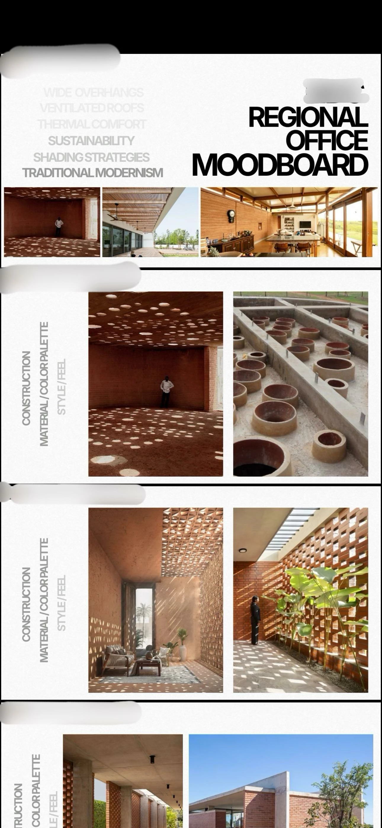
I’m putting together a moodboard to present exemplary project references to a client for a new regional office secretariat (specifically focusing on climate-responsive design in the Savannah Region). The goal is to keep the presentation clean and image-focused so the client can quickly grasp the intended architectural language like passive cooling, central courtyards, and local material accents before we move into rigid schematics.
**Target Audience:**
The client and stakeholders for the regional office building, who need to clearly understand the proposed "Traditional Modernism" aesthetic and thermal comfort strategies without being overwhelmed by technical data.
**Design Decisions:**
**Typography & Hierarchy:** I used varying shades and weights of grey to establish a strict visual hierarchy. The deep grey, bold, and larger text ("REGIONAL OFFICE MOODBOARD") acts as the primary focal point.
**Side Text & Categorization:** The purpose of the vertical side text ("CONSTRUCTION", "MATERIAL/COLOR PALETTE", etc.) highlighted in a darker tone is to clearly communicate the intent of each image grouping. The lightest grey text is of lesser importance, serving as subtle stylistic tagging so it doesn't compete with the actual photography.
**Layout:** I went with a clean, compartmentalized grid layout itself which reflects the open, airy feel of the architectural concepts.
#art
**Objective:**
I’m putting together a moodboard to present exemplary project references to a client for a new regional office secretariat (specifically focusing on climate-responsive design in the Savannah Region). The goal is to keep the presentation clean and image-focused so the client can quickly grasp the intended architectural language like passive cooling, central courtyards, and local material accents before we move into rigid schematics.
**Target Audience:**
The client and stakeholders for the regional office building, who need to clearly understand the proposed "Traditional Modernism" aesthetic and thermal comfort strategies without being overwhelmed by technical data.
**Design Decisions:**
**Typography & Hierarchy:** I used varying shades and weights of grey to establish a strict visual hierarchy. The deep grey, bold, and larger text ("REGIONAL OFFICE MOODBOARD") acts as the primary focal point.
**Side Text & Categorization:** The purpose of the vertical side text ("CONSTRUCTION", "MATERIAL/COLOR PALETTE", etc.) highlighted in a darker tone is to clearly communicate the intent of each image grouping. The lightest grey text is of lesser importance, serving as subtle stylistic tagging so it doesn't compete with the actual photography.
**Layout:** I went with a clean, compartmentalized grid layout itself which reflects the open, airy feel of the architectural concepts.
#art


| 4,000 mlx | |
| 4 | |
| 0 |