UI thoughts on my project This is a project that I've been…

0 reactions
UI thoughts on my project
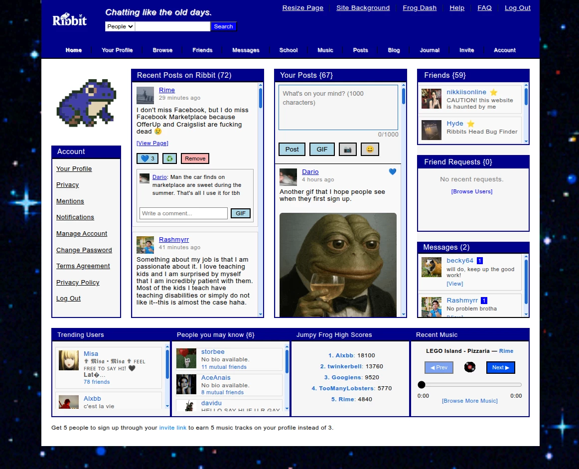
This is a project that I've been working on in my dorm at college. I wanted to intentionally design a site that appears quieter, and especially one that is pleasing to look at.
I designed it for people who miss early 2000s web forums or prefer slower-paced online interaction.
**Some of my design decisions (home page only):**
* Strong borders and box layouts
* Fixed-width layout for visual consistency
* Pagination instead of infinite scrolling
* Multiple themes (green, blue, pink, dark) to reflect expressive customization
**Constraints:**
* Tried to design it in a way that is nostalgic, but without being unusable or confusing to the average person using it.
**What I’m Looking For:**
* Feedback on the aesthetics of it
* Whether the themes are overboard, or if there are any extra suggestions for other themes to add, or even if I should change the theme in the picture
I'm also wondering if there is too much going on. Should things be removed for simplicity?
#art
source
This is a project that I've been working on in my dorm at college. I wanted to intentionally design a site that appears quieter, and especially one that is pleasing to look at.
I designed it for people who miss early 2000s web forums or prefer slower-paced online interaction.
**Some of my design decisions (home page only):**
* Strong borders and box layouts
* Fixed-width layout for visual consistency
* Pagination instead of infinite scrolling
* Multiple themes (green, blue, pink, dark) to reflect expressive customization
**Constraints:**
* Tried to design it in a way that is nostalgic, but without being unusable or confusing to the average person using it.
**What I’m Looking For:**
* Feedback on the aesthetics of it
* Whether the themes are overboard, or if there are any extra suggestions for other themes to add, or even if I should change the theme in the picture
I'm also wondering if there is too much going on. Should things be removed for simplicity?
#art
source


| 3,000 mlx | |
| 4 | |
| 0 |