#DesignTheTangledLogo #earn -activity By: @alidino…

6 reactions
#DesignTheTangledLogo #earn -activity
By:
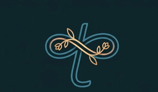
The New Logo: By using a muted teal combined with soft gold/peach tones, the brand immediately feels more "pleasant" and inviting. It shifts the perception from a sterile software look to a lifestyle or community-focused brand.
The logo represents Tangled by showing that when different paths (the lines) and different lives (the organic leaves) cross, they don't just create a knot—they create a strong, infinite bond. It turns the word "tangled" from something potentially negative into a symbol of intricate beauty and togetherness.
By:
The New Logo: By using a muted teal combined with soft gold/peach tones, the brand immediately feels more "pleasant" and inviting. It shifts the perception from a sterile software look to a lifestyle or community-focused brand.
The logo represents Tangled by showing that when different paths (the lines) and different lives (the organic leaves) cross, they don't just create a knot—they create a strong, infinite bond. It turns the word "tangled" from something potentially negative into a symbol of intricate beauty and togetherness.


3

1

1
| 59,000 mlx | |
| 19 | |
| 6 |