Contrast-based typographic tee — quiet front, loud back…

0 reactions
Contrast-based typographic tee — quiet front, loud back
I’m exploring contrast in apparel design:
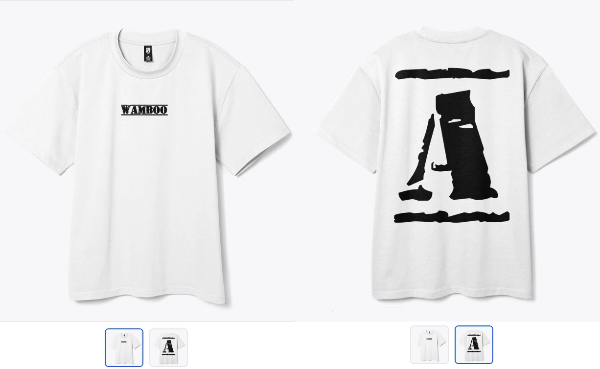
a very subtle, almost blank front paired with a bold, raw typographic back.
The idea is to create visual tension between minimal branding and expressive form — something that feels calm from the front but becomes a statement when seen from behind.
I’d love critique on:
– typographic balance
– negative space
– visual hierarchy between front and back
– whether the contrast reads intentional or confusing
#art
I’m exploring contrast in apparel design:
a very subtle, almost blank front paired with a bold, raw typographic back.
The idea is to create visual tension between minimal branding and expressive form — something that feels calm from the front but becomes a statement when seen from behind.
I’d love critique on:
– typographic balance
– negative space
– visual hierarchy between front and back
– whether the contrast reads intentional or confusing
#art


| 1,000 mlx | |
| 2 | |
| 0 |