#DesignTheTangledLogo #earn activity g/studio @alidino ✨…

0 reactions
#DesignTheTangledLogo #earn activity
✨ Tenglad Logo Design Ideas! ✨
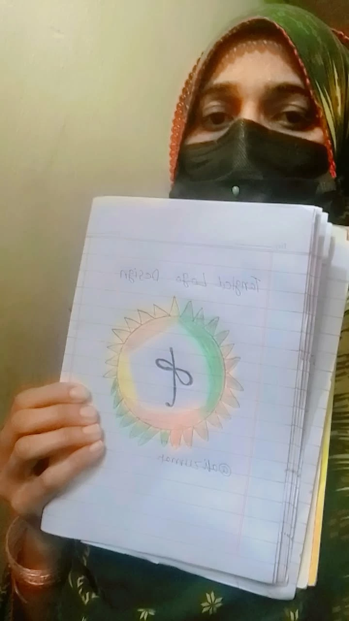
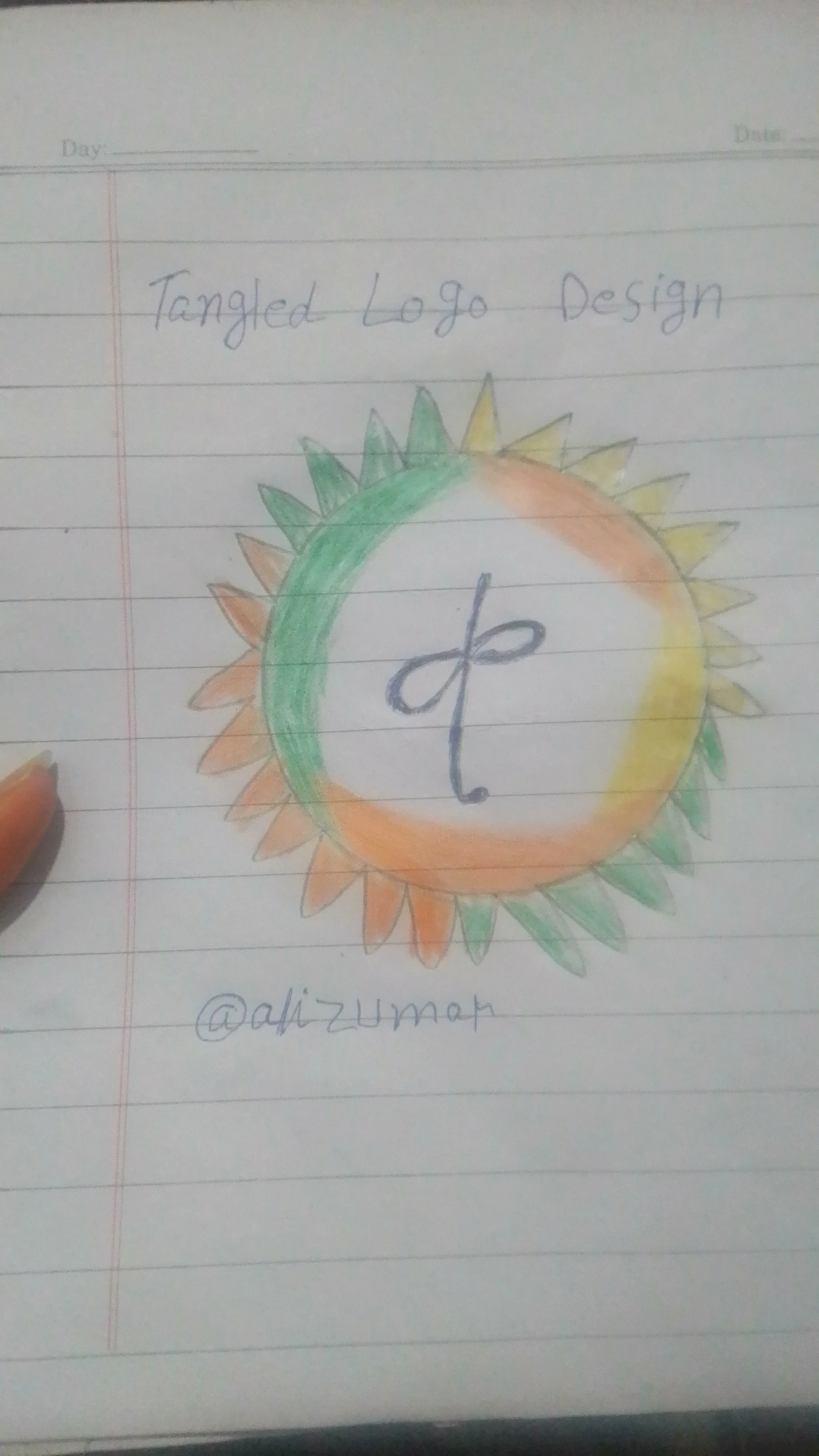
If I had the chance to design a new Confused logo, I would create a circular logo that represents unity and connection 🔵
In the middle are network-style lines that show that every user is connected to each other 🌐
And the glowing heart 💛 shows positivity and community spirit.
The colors of the logo are:
💚 Green = growth and harmony.
🟠 Orange = energy and enthusiasm
💛 Yellow = positivity and happiness
My design sees that Confused Surf is not a platform, but a family where creativity and support meet 🤝✨tagg ..
✨ Tenglad Logo Design Ideas! ✨
If I had the chance to design a new Confused logo, I would create a circular logo that represents unity and connection 🔵
In the middle are network-style lines that show that every user is connected to each other 🌐
And the glowing heart 💛 shows positivity and community spirit.
The colors of the logo are:
💚 Green = growth and harmony.
🟠 Orange = energy and enthusiasm
💛 Yellow = positivity and happiness
My design sees that Confused Surf is not a platform, but a family where creativity and support meet 🤝✨tagg ..


| 4,000 mlx | |
| 21 | |
| 0 |