I wondered why gas price is all over the news Fuel price…

0 reactions
I wondered why gas price is all over the news
Fuel price spikes look small in absolute terms — $1/gallon, \~$50/month per household. But as a share of disposable income (after tax, after rent, after groceries) that number varies wildly by county.
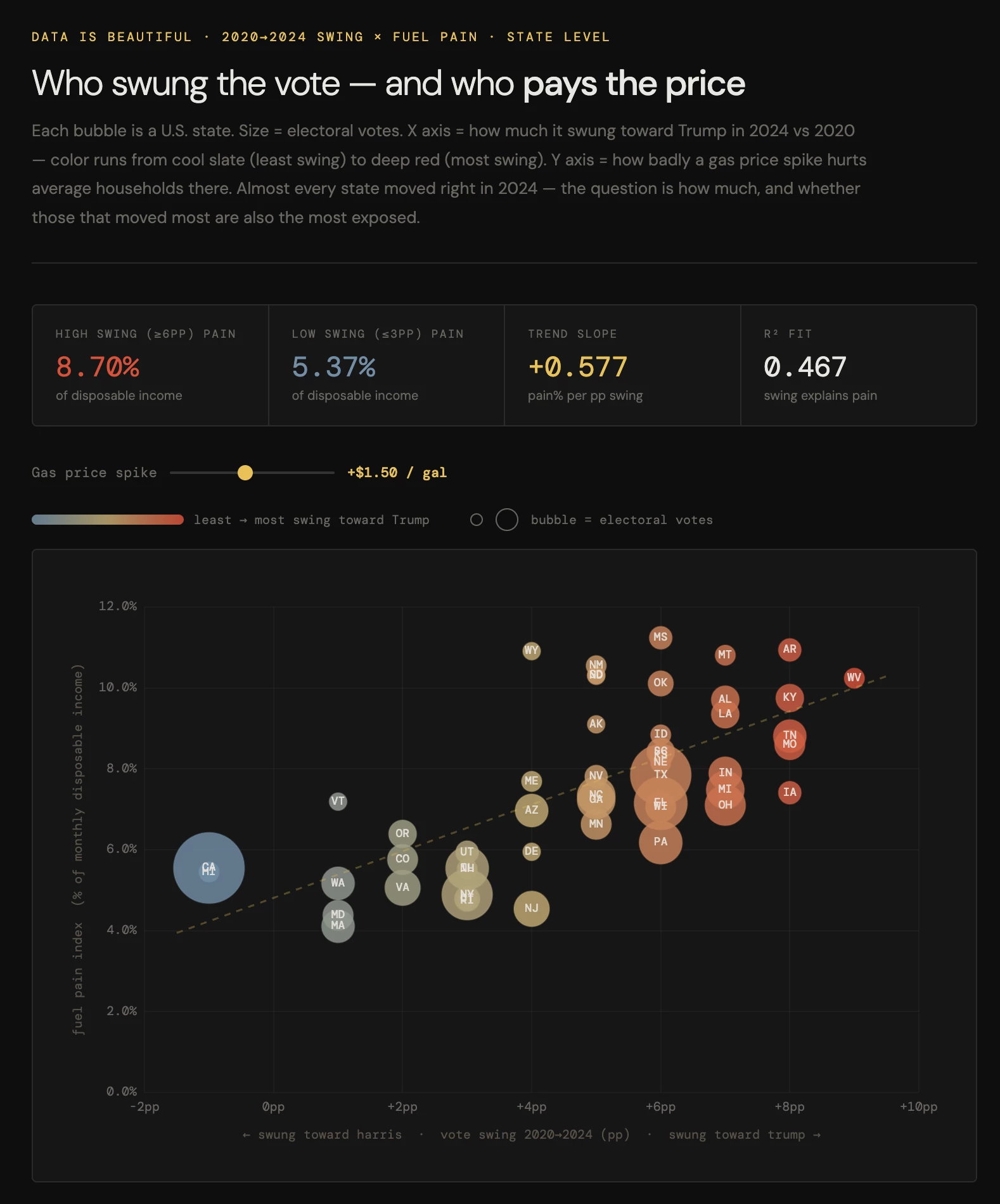
Crossed that against 2020→2024 presidential swing data. Bubble chart, one bubble per state, sized by electoral votes.
The dark irony: the states that moved most toward Trump in 2024 tend to be the ones where a fuel spike bites hardest. Not making a causal claim — rurality drives both. But the overlap is real.
\---
\*\*Tools:\*\* Claude (analysis + code), Chart.js, vanilla HTML/CSS/JS
\*\*Sources:\*\* MIT Election Lab (2020 & 2024 results) · ACS 2023 median household income · EIA state fuel consumption · MERIC cost-of-living indices · BLS Consumer Expenditure Survey
#education
source
Fuel price spikes look small in absolute terms — $1/gallon, \~$50/month per household. But as a share of disposable income (after tax, after rent, after groceries) that number varies wildly by county.
Crossed that against 2020→2024 presidential swing data. Bubble chart, one bubble per state, sized by electoral votes.
The dark irony: the states that moved most toward Trump in 2024 tend to be the ones where a fuel spike bites hardest. Not making a causal claim — rurality drives both. But the overlap is real.
\---
\*\*Tools:\*\* Claude (analysis + code), Chart.js, vanilla HTML/CSS/JS
\*\*Sources:\*\* MIT Election Lab (2020 & 2024 results) · ACS 2023 median household income · EIA state fuel consumption · MERIC cost-of-living indices · BLS Consumer Expenditure Survey
#education
source


| 1,000 mlx | |
| 2 | |
| 0 |