UK house prices and Find my Area Tool - match scores shown…

0 reactions
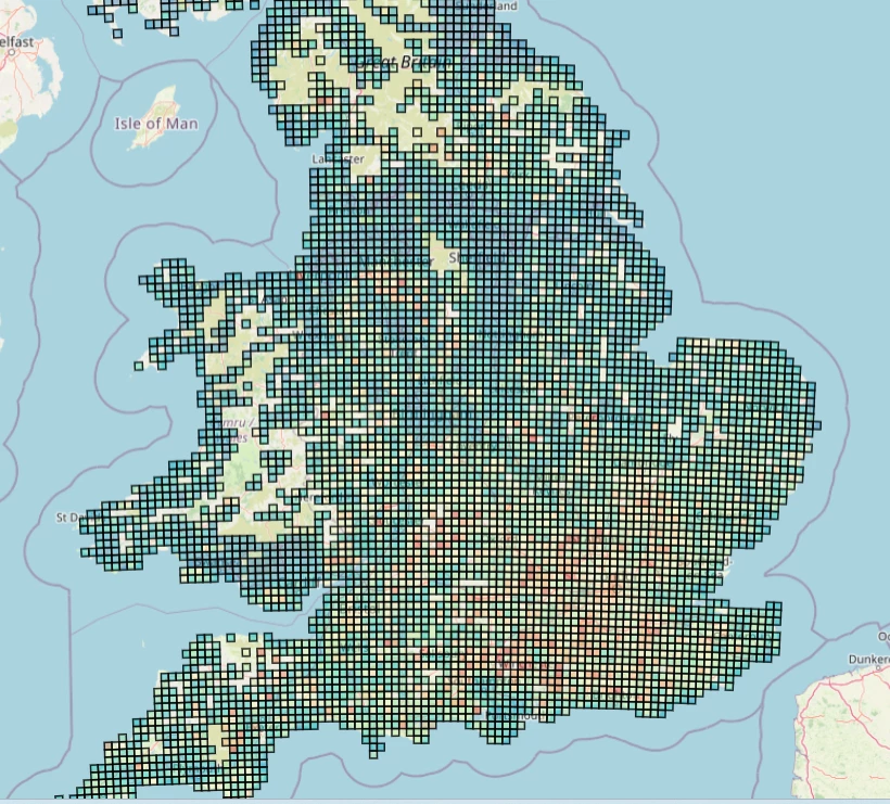
UK house prices and Find my Area Tool - match scores shown on a 1km>25km grid
Link - propertypricemap.co.uk http://propertypricemap.co.uk
I built an interactive UK housing data map. It shows **median sold prices** on a fixed size grid (1 km, 5 km, 10 km, 25 km) so patterns are comparable across the country.
The main feature is **Find My Area**. You set priorities like budget, flood safety, schools, crime, station distance, and local age profile, and it scores **every 1 km square** from **0 to 100%** so you can shortlist areas fast, especially if you do not know where to start or you are relocating.
You can also switch between metrics (median, change over time, £ per ft² in England), toggle overlays (flood, schools, crime, community age, stations), and right click anywhere to snap to the nearest postcode and get a local breakdown.
* What’s your overall impression of this, useful, confusing, somewhere in between?
* Does the “Find My Area” idea make sense straight away, or does it need better framing?
* If you could change one thing to make it feel more intuitive, what would it be?
* What would you add or remove to make it feel more like a product you would actually use?
This is not a Zoopla or Rightmove replacement. It is a reverse search tool that helps you figure out where you might want to live first, then you can dive into the actual property listings.
Data sources
* Sold prices (England and Wales), HM Land Registry Price Paid Data
* Sold prices (Scotland), Registers of Scotland (coverage can lag and may be partial)
* Floor area for £ per ft², EPC data (England only)
* Flood risk, Environment Agency (England only)
* Schools, Ofsted inspection data (England only)
* Crime, data.police.uk http://data.police.uk, aggregated to LSOA (England and Wales)
* Community age, Census 2021 (UK wide)
* Train stations, National Rail station location data (Great Britain)
Tools used
* Python for data processing (pandas, geopandas, pyproj)
* MapLibre GL JS for the interactive map
* Cloudflare R2 for storage and Cloudflare Pages for hosting
#education
source
Link - propertypricemap.co.uk http://propertypricemap.co.uk
I built an interactive UK housing data map. It shows **median sold prices** on a fixed size grid (1 km, 5 km, 10 km, 25 km) so patterns are comparable across the country.
The main feature is **Find My Area**. You set priorities like budget, flood safety, schools, crime, station distance, and local age profile, and it scores **every 1 km square** from **0 to 100%** so you can shortlist areas fast, especially if you do not know where to start or you are relocating.
You can also switch between metrics (median, change over time, £ per ft² in England), toggle overlays (flood, schools, crime, community age, stations), and right click anywhere to snap to the nearest postcode and get a local breakdown.
* What’s your overall impression of this, useful, confusing, somewhere in between?
* Does the “Find My Area” idea make sense straight away, or does it need better framing?
* If you could change one thing to make it feel more intuitive, what would it be?
* What would you add or remove to make it feel more like a product you would actually use?
This is not a Zoopla or Rightmove replacement. It is a reverse search tool that helps you figure out where you might want to live first, then you can dive into the actual property listings.
Data sources
* Sold prices (England and Wales), HM Land Registry Price Paid Data
* Sold prices (Scotland), Registers of Scotland (coverage can lag and may be partial)
* Floor area for £ per ft², EPC data (England only)
* Flood risk, Environment Agency (England only)
* Schools, Ofsted inspection data (England only)
* Crime, data.police.uk http://data.police.uk, aggregated to LSOA (England and Wales)
* Community age, Census 2021 (UK wide)
* Train stations, National Rail station location data (Great Britain)
Tools used
* Python for data processing (pandas, geopandas, pyproj)
* MapLibre GL JS for the interactive map
* Cloudflare R2 for storage and Cloudflare Pages for hosting
#education
source


| 0 mlx | |
| 3 | |
| 0 |