75 Years of U.S. Economic Indicators — Unemployment…

0 reactions
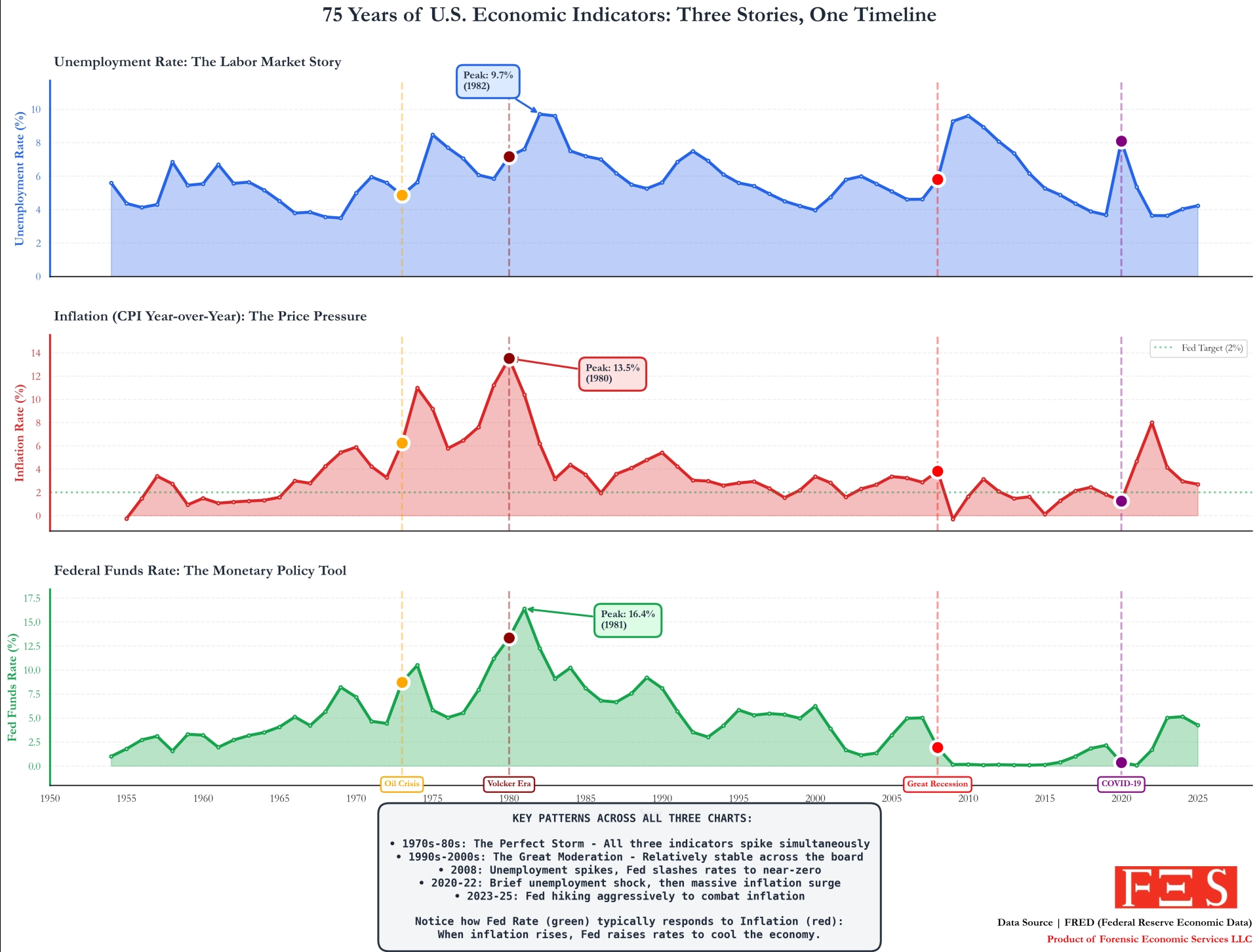
75 Years of U.S. Economic Indicators — Unemployment, Inflation, and Federal Interest Rates on One Timeline (1950-2025
**Data Sources:**
• FRED – Federal Reserve Economic Data (https://fred.stlouisfed.org/)
• Series used: UNRATE, CPIAUCNS, FEDFUNDS
**Tools:**
• R (tidyverse, ggplot2) + FRED API
• Graphic layout in Affinity Designer
**What the chart shows:**
This is a 75-year timeline of three major U.S. economic indicators on one visual:
• **Unemployment Rate** (labor market conditions)
• **Inflation (CPI, YoY%)** (price pressure & purchasing power)
• **Federal Funds Rate** (monetary policy lever)
Plotted together, the relationship becomes clearer:
📌 **1970s–1980s:** A “perfect storm” — unemployment, inflation, and interest rates all spike simultaneously.
📌 **1990s–2000s:** A long stretch of relative stability — the "Great Moderation."
📌 **2008:** Unemployment spikes as the Fed slashes rates toward 0% to support the economy.
📌 **2020-22:** Rates drop to near-zero again, then increase aggressively to combat post-pandemic inflation.
**Key pattern:**
When inflation rises, the Fed often raises interest rates to slow the economy, which can lead to higher unemployment later — a feedback loop of policy vs. economic reality.
**Made by:** Forensic Economic Services LLC, rule703.com http://rule703.com
*(product credit only, not a solicitation)*
#education
source
**Data Sources:**
• FRED – Federal Reserve Economic Data (https://fred.stlouisfed.org/)
• Series used: UNRATE, CPIAUCNS, FEDFUNDS
**Tools:**
• R (tidyverse, ggplot2) + FRED API
• Graphic layout in Affinity Designer
**What the chart shows:**
This is a 75-year timeline of three major U.S. economic indicators on one visual:
• **Unemployment Rate** (labor market conditions)
• **Inflation (CPI, YoY%)** (price pressure & purchasing power)
• **Federal Funds Rate** (monetary policy lever)
Plotted together, the relationship becomes clearer:
📌 **1970s–1980s:** A “perfect storm” — unemployment, inflation, and interest rates all spike simultaneously.
📌 **1990s–2000s:** A long stretch of relative stability — the "Great Moderation."
📌 **2008:** Unemployment spikes as the Fed slashes rates toward 0% to support the economy.
📌 **2020-22:** Rates drop to near-zero again, then increase aggressively to combat post-pandemic inflation.
**Key pattern:**
When inflation rises, the Fed often raises interest rates to slow the economy, which can lead to higher unemployment later — a feedback loop of policy vs. economic reality.
**Made by:** Forensic Economic Services LLC, rule703.com http://rule703.com
*(product credit only, not a solicitation)*
#education
source


| 3,000 mlx | |
| 3 | |
| 0 |