
6 reactions
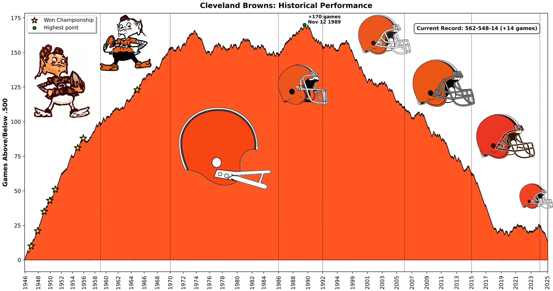
hThe Cleveland Browns’ rise and fall, visualized with games above/below a .500 record
I used game data to visualize the historical performance of each NFL franchise using cumulative games above/below .500. The Cleveland Browns' chart is one of the most interesting. You can find all the charts here on Imgur https://imgur.com/a/nfl-teams-historical-performance-RSodTbm.
**Methodology**: A 0.500 record means a record with as many wins as losses (for exemple, 562 wins - 562 losses and 14 ties is a .500 record). Each win moves the line up (+1), each loss moves it down (-1), and ties keep the value unchanged. A vertical dotted line shows a logo change. Only regular season games are included.
**Tools used:** Python (BeautifulSoup4, matplotlib, pandas, numpy)
**Sources:** Pro Football Reference https://www.pro-football-reference.com/ for the data and Sportslogo.net ttps://www.sportslogos.net for the logos.
#education
source
I used game data to visualize the historical performance of each NFL franchise using cumulative games above/below .500. The Cleveland Browns' chart is one of the most interesting. You can find all the charts here on Imgur https://imgur.com/a/nfl-teams-historical-performance-RSodTbm.
**Methodology**: A 0.500 record means a record with as many wins as losses (for exemple, 562 wins - 562 losses and 14 ties is a .500 record). Each win moves the line up (+1), each loss moves it down (-1), and ties keep the value unchanged. A vertical dotted line shows a logo change. Only regular season games are included.
**Tools used:** Python (BeautifulSoup4, matplotlib, pandas, numpy)
**Sources:** Pro Football Reference https://www.pro-football-reference.com/ for the data and Sportslogo.net ttps://www.sportslogos.net for the logos.
#education
source


| 14,001 mlx | |
| 28 | |
| 6 |