Five months of my stock-ranking model as a bump chart. The…

0 reactions
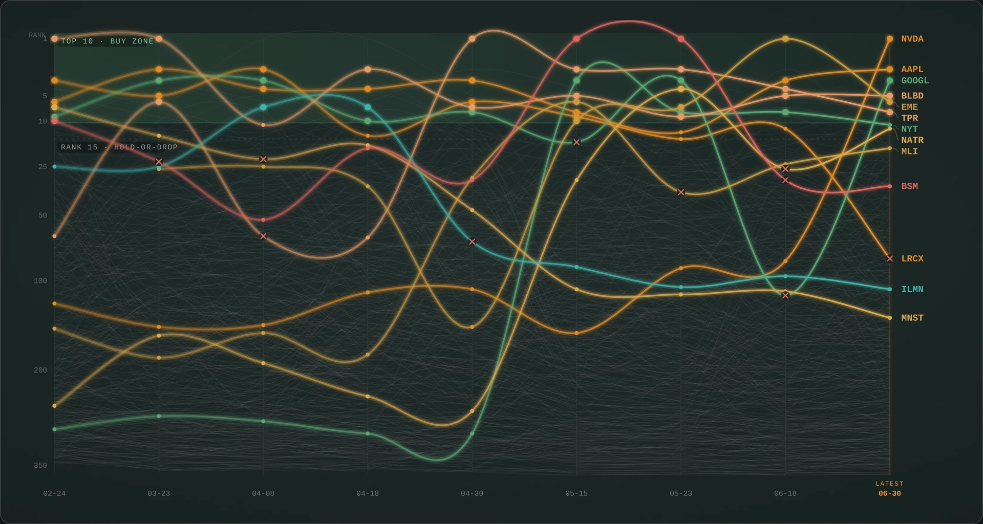
Five months of my stock-ranking model as a bump chart. The bright lines reached the top 10, the faint ones are the other 360
This is a side project of mine. Every couple of weeks my algorithm scores every US stock I can pull data for, around 370 of them, and ranks them 1 to 370.
The chart follows that leaderboard across 9 rounds from February to June. Each line is one stock, and the higher it sits the better it scored that round. The bright lines are the ones that got near the top at some point, and the faint threads behind them are everyone else. The green band up top is the top 10. When a stock the model is holding slips past rank 15 it gets dropped, and those are the red X marks.
Data's from Financial Modeling Prep. The ranking is my own Python system.
If anyone wants to see the tool or how the ranking works, just ask.
#education
source
This is a side project of mine. Every couple of weeks my algorithm scores every US stock I can pull data for, around 370 of them, and ranks them 1 to 370.
The chart follows that leaderboard across 9 rounds from February to June. Each line is one stock, and the higher it sits the better it scored that round. The bright lines are the ones that got near the top at some point, and the faint threads behind them are everyone else. The green band up top is the top 10. When a stock the model is holding slips past rank 15 it gets dropped, and those are the red X marks.
Data's from Financial Modeling Prep. The ranking is my own Python system.
If anyone wants to see the tool or how the ranking works, just ask.
#education
source


| 2,000 mlx | |
| 4 | |
| 0 |