Commercial Fusion Breakeven: Are the Promises Getting…

0 reactions
Commercial Fusion Breakeven: Are the Promises Getting Closer?
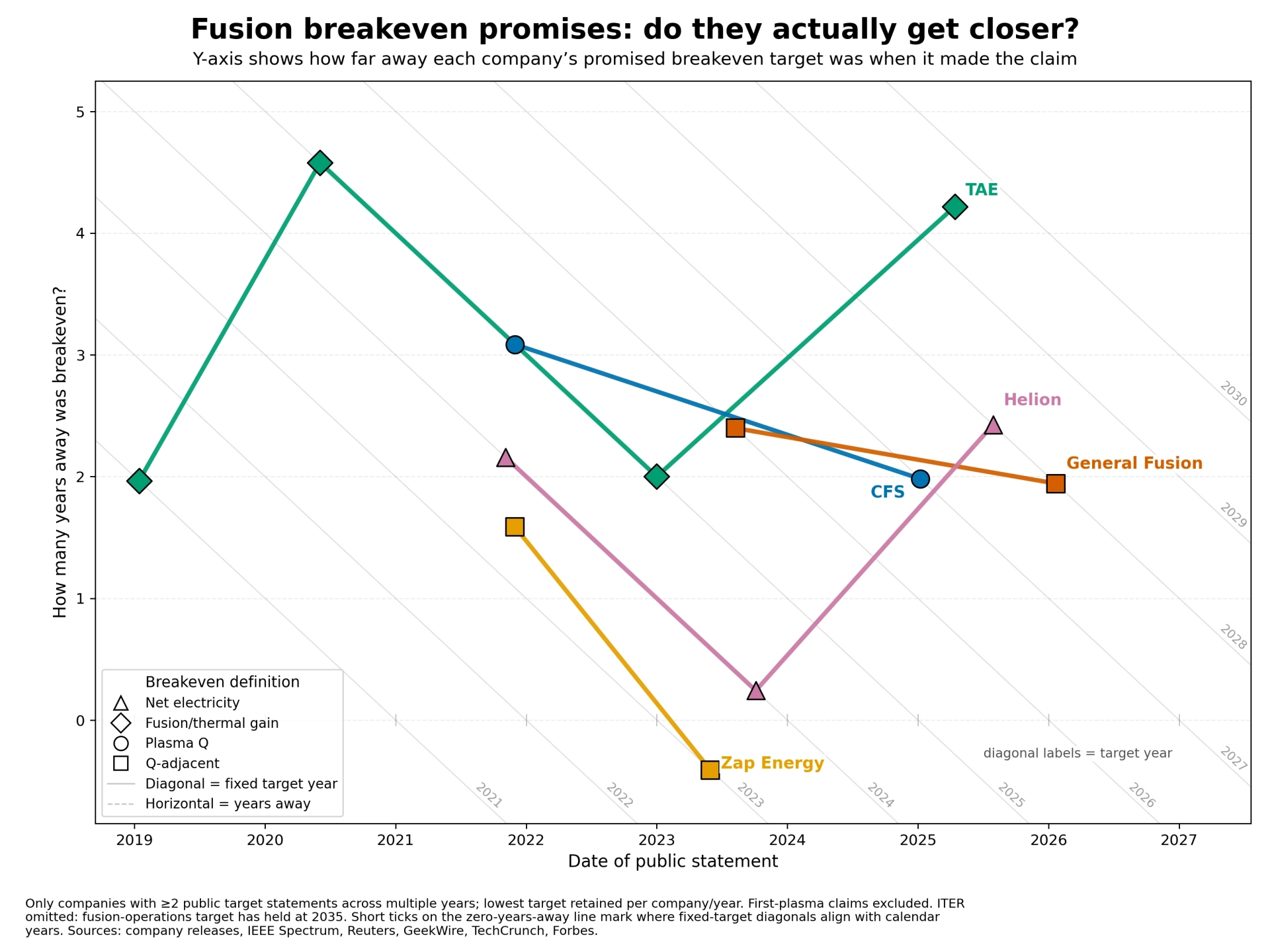
Inspired by the well-known fusion breakeven/progress charts https://pubs.aip.org/view-large/figure/82970921/062103_1_f3.jpg , I made a simpler “promise tracking” chart for commercial fusion timelines.
This is not meant as a criticism of the technical work. First-of-a-kind engineering is hard, and progress can look like one step forward, two steps back.
The x-axis is the date of a public statement. The y-axis is how many years away the stated breakeven target was at the time of the claim. Diagonal guide lines represent fixed target years, so a company whose promise is unchanged should move down along the same diagonal as time passes. Points above or to the right of that diagonal imply the target date has slipped.
A few caveats:
* I mixed different definitions of “breakeven” only where the company’s public language made that unavoidable, so I marked the type with point shapes.
* I’m sure the dataset is incomplete. I’d welcome corrections, missing companies, better sources, or pushback on whether this framing is useful.
Tools and sources
* https://github.com/uncomposed/fusion-breakeven-drift/tree/main/data
* pandas: 2.0
* matplotlib: 3.7
#education
source
Inspired by the well-known fusion breakeven/progress charts https://pubs.aip.org/view-large/figure/82970921/062103_1_f3.jpg , I made a simpler “promise tracking” chart for commercial fusion timelines.
This is not meant as a criticism of the technical work. First-of-a-kind engineering is hard, and progress can look like one step forward, two steps back.
The x-axis is the date of a public statement. The y-axis is how many years away the stated breakeven target was at the time of the claim. Diagonal guide lines represent fixed target years, so a company whose promise is unchanged should move down along the same diagonal as time passes. Points above or to the right of that diagonal imply the target date has slipped.
A few caveats:
* I mixed different definitions of “breakeven” only where the company’s public language made that unavoidable, so I marked the type with point shapes.
* I’m sure the dataset is incomplete. I’d welcome corrections, missing companies, better sources, or pushback on whether this framing is useful.
Tools and sources
* https://github.com/uncomposed/fusion-breakeven-drift/tree/main/data
* pandas: 2.0
* matplotlib: 3.7
#education
source


| 2,000 mlx | |
| 2 | |
| 0 |