What's the Pulse? Up to date visual maps of curiosity by…

0 reactions
What's the Pulse? Up to date visual maps of curiosity by region
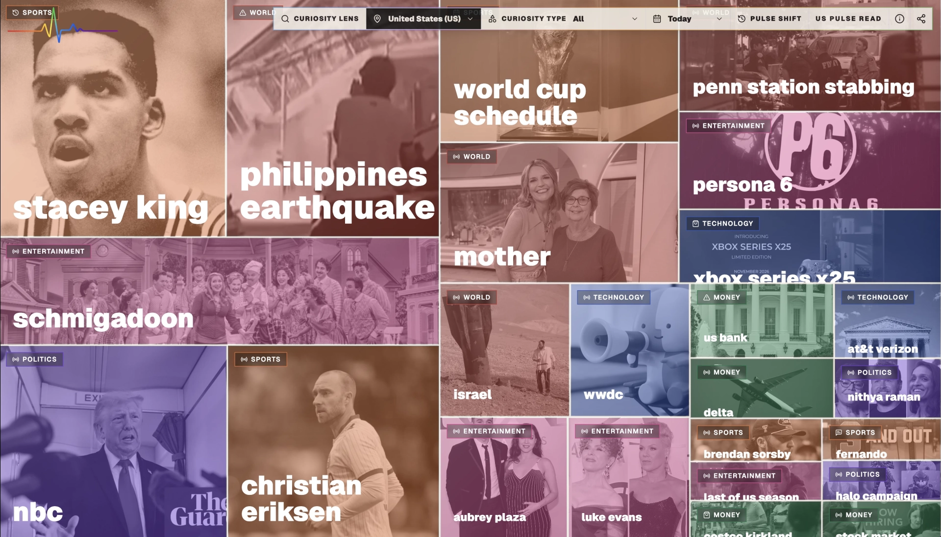
I've been working on visualizing curiosity, or trending search data to see what people are interested in at a given moment in any area of the world. Larger tiles are more popular etc. Colors are meaningful to gather at a glance for what people care about (orange is sports, purple politics), and there are icons to view the intent around the search (following, debating, worrying, planning, buying etc).
https://www.whatsthepulse.com
Data sources: trending search data from multiple search engines (Google, others). Visualization tools are HTML, Tailwind (NextJS) web application building a tree map of trending searches and related infrormation.
The website keeps this data updated all the time for all kinds of different regions, and records it over time. It enriches trending searches and terms with images, related context and provides summaries of why people are searching for that thing.. and provides what's called the "Pulse Read" or TL;DR summary of what people really care about aka the "pulse" of the region. Have been experimenting with lots of new features, please go check it out and let me know what you think!
#education
source
I've been working on visualizing curiosity, or trending search data to see what people are interested in at a given moment in any area of the world. Larger tiles are more popular etc. Colors are meaningful to gather at a glance for what people care about (orange is sports, purple politics), and there are icons to view the intent around the search (following, debating, worrying, planning, buying etc).
https://www.whatsthepulse.com
Data sources: trending search data from multiple search engines (Google, others). Visualization tools are HTML, Tailwind (NextJS) web application building a tree map of trending searches and related infrormation.
The website keeps this data updated all the time for all kinds of different regions, and records it over time. It enriches trending searches and terms with images, related context and provides summaries of why people are searching for that thing.. and provides what's called the "Pulse Read" or TL;DR summary of what people really care about aka the "pulse" of the region. Have been experimenting with lots of new features, please go check it out and let me know what you think!
#education
source


| 0 mlx | |
| 0 | |
| 0 |