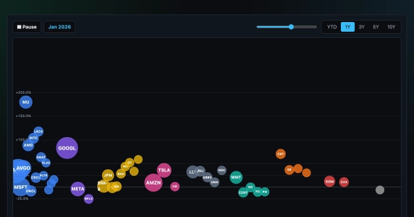
Animation showing the YTD performance of large cap US…

0 reactions
Animation showing the YTD performance of large cap US stocks
Sources: Twelve Data twelvedata.com http://twelvedata.com (prices) + SEC EDGAR (shares outstanding).
Tool: custom-built in React/Next.js (no charting library)
How to read it: vertical position = total return since the start of the selected window, bubble size = market cap, color = sector. Press play to sweep day-by-day; toggle log scale for the long windows.
You can select the time period of the animation (YTD, 1Y, etc.)
There are more visualizations on this page: https://chartrow.com/visuals
Feel free to DM me or post here for feedback!
#education
source
Sources: Twelve Data twelvedata.com http://twelvedata.com (prices) + SEC EDGAR (shares outstanding).
Tool: custom-built in React/Next.js (no charting library)
How to read it: vertical position = total return since the start of the selected window, bubble size = market cap, color = sector. Press play to sweep day-by-day; toggle log scale for the long windows.
You can select the time period of the animation (YTD, 1Y, etc.)
There are more visualizations on this page: https://chartrow.com/visuals
Feel free to DM me or post here for feedback!
#education
source


| 4,000 mlx | |
| 5 | |
| 0 |